
By Katya · January 29, 2026
How Training for a Marathon Led Me to Build RunPlan: A UX Case Study
My name is Katya, I am a UX designer, and I love to run. In 2025, I set a goal that was both terrifying and beautiful: running the Amsterdam Marathon. Since the race coincided with my birthday, it felt like a sign.
The Problem: Great Plans, Poor Execution
I’ve been a runner for a while, with several 5Ks and half-marathons under my belt. But the full marathon is different. It’s not just a race; it is a project that needs time, consistency, and long-term commitment. So, I needed a plan.
Of course, I started with ChatGPT, and it generated a good training foundation. It is just text in a chat window, and I can’t download or track these workouts on my Apple Watch. So, I needed a tool.
I downloaded many different running apps, from well-known industry giants to indie ones. And in each one, I couldn’t find what I needed. I encountered authentication issues, the inability to create or view a plan, poor watch sync, and overloaded interfaces where I couldn’t figure out what to do.
Market Analysis: Why the Giants Failed My User Journey
1. Nike Run Club (NRC): The Personalization Gap
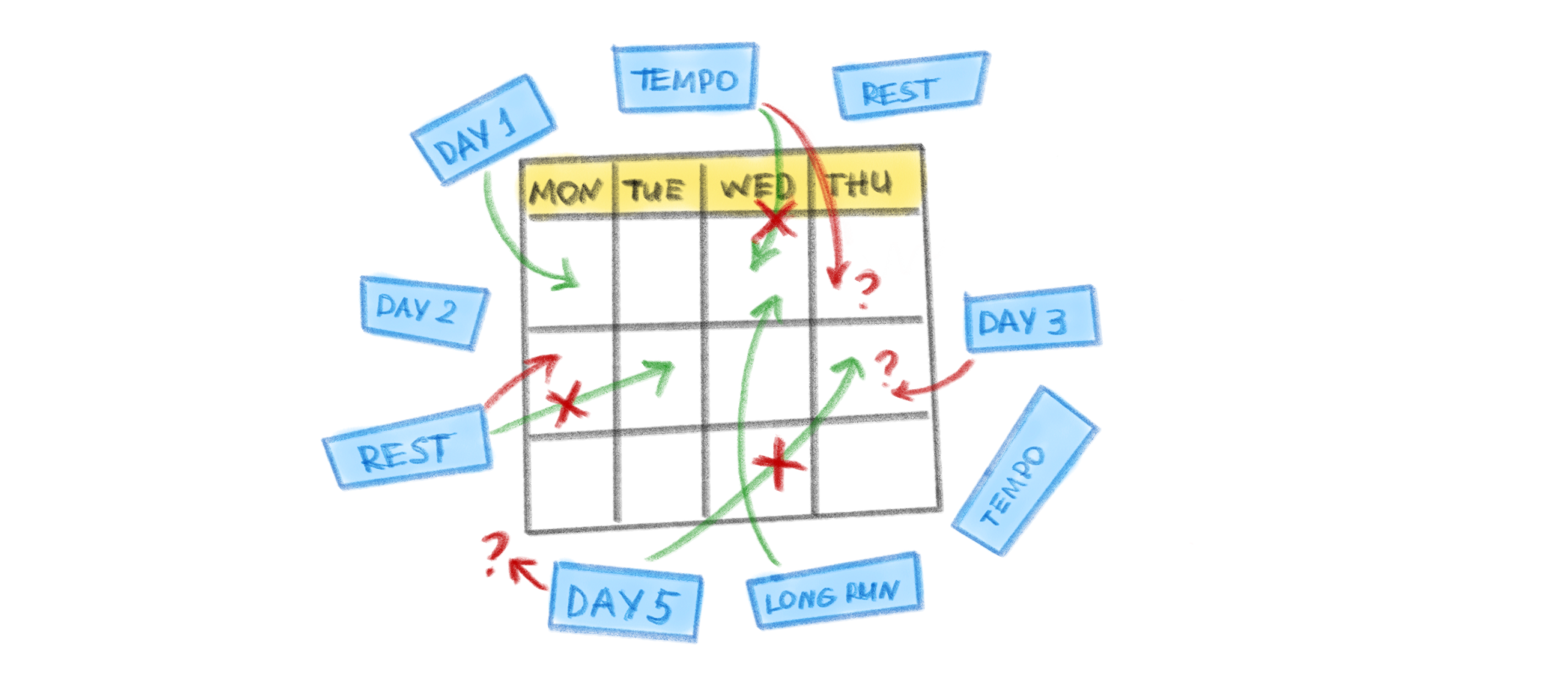
My biggest pain point with NRC is the “Day 1, Day 2” logic in their plans. It feels like being in a vacuum, detached from a real-world calendar.
“It’s Wednesday; am I on Day 3 or 4? Did I miss yesterday, or was it a rest day?”
For a user, this creates immense cognitive load. The lack of a calendar grid turns preparation into a guessing game.
2. Runkeeper: Technical Debt and “Dark UX”
With Runkeeper, I couldn’t get very far. First, even logging in was a hassle, and I was about to give up. Next, aggressive paywalls blocked my path. You cannot see the plan structure until you commit to a subscription. Even basic analytical reports are locked behind a premium tier. And as a bonus, frequent sync issues with Apple Watch meant workouts often failed to launch or save correctly.
“But how do I know I’m paying for something worthwhile?”
For the user, this creates uncertainty: you can’t tell what you’d be paying for. And a beginner who can’t see the shape of the plan is likely to give up halfway through, if not at the very beginning.
3. Runna: Subscription Fatigue
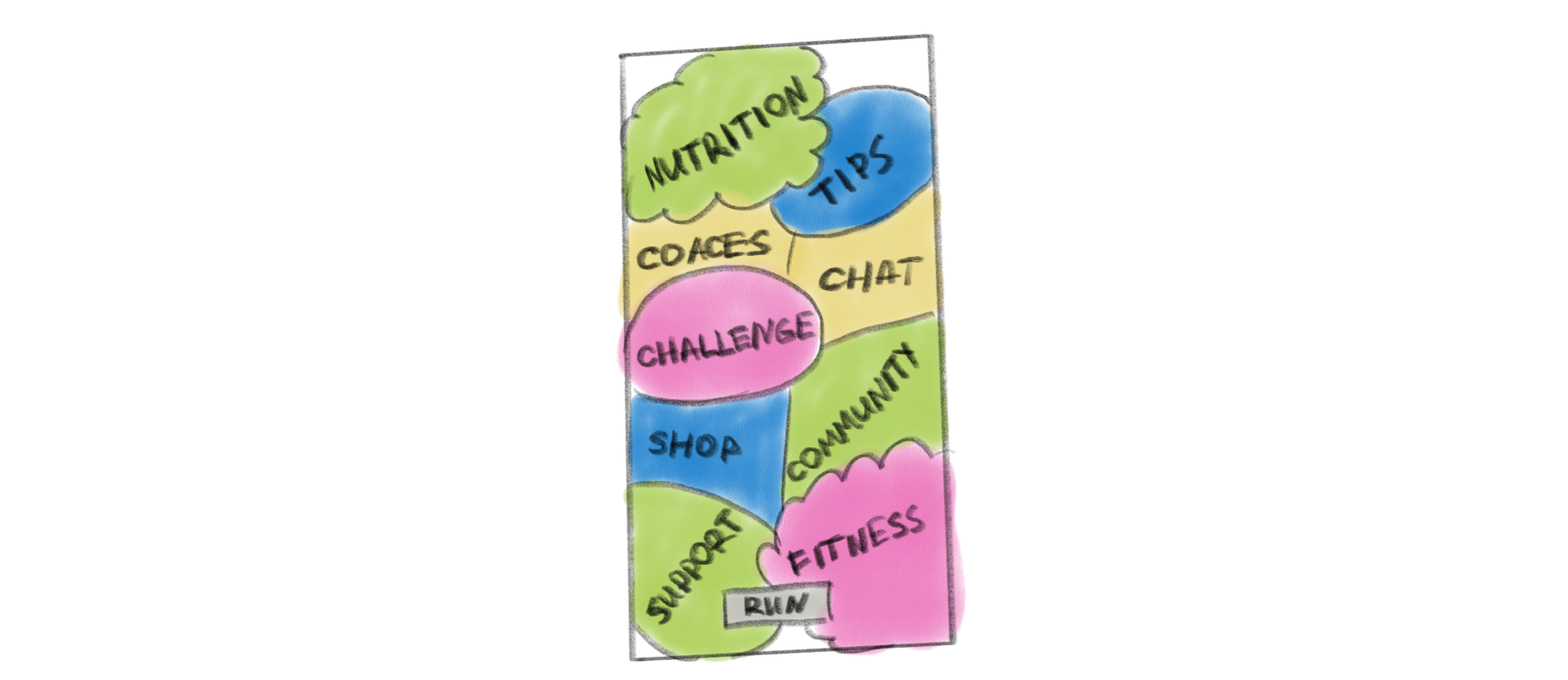
Runna is a really cool product. It offers free basic plans, structure, and a variety of workouts. And it also has a community, advice from elite coaches, and access to events. It’s great, but I definitely won’t use it all. And paying €20 a month for features I don’t need seemed to me like a barrier. Plus, it took me a while to get through the long onboarding process just to understand what the app was all about.
“I needed a simple running tool, not another ecosystem demanding my attention.”
For a user, the cost is focus. I came to train for one race; the app kept handing me eight other things to care about.
4. Apple Workouts: Perfect but…
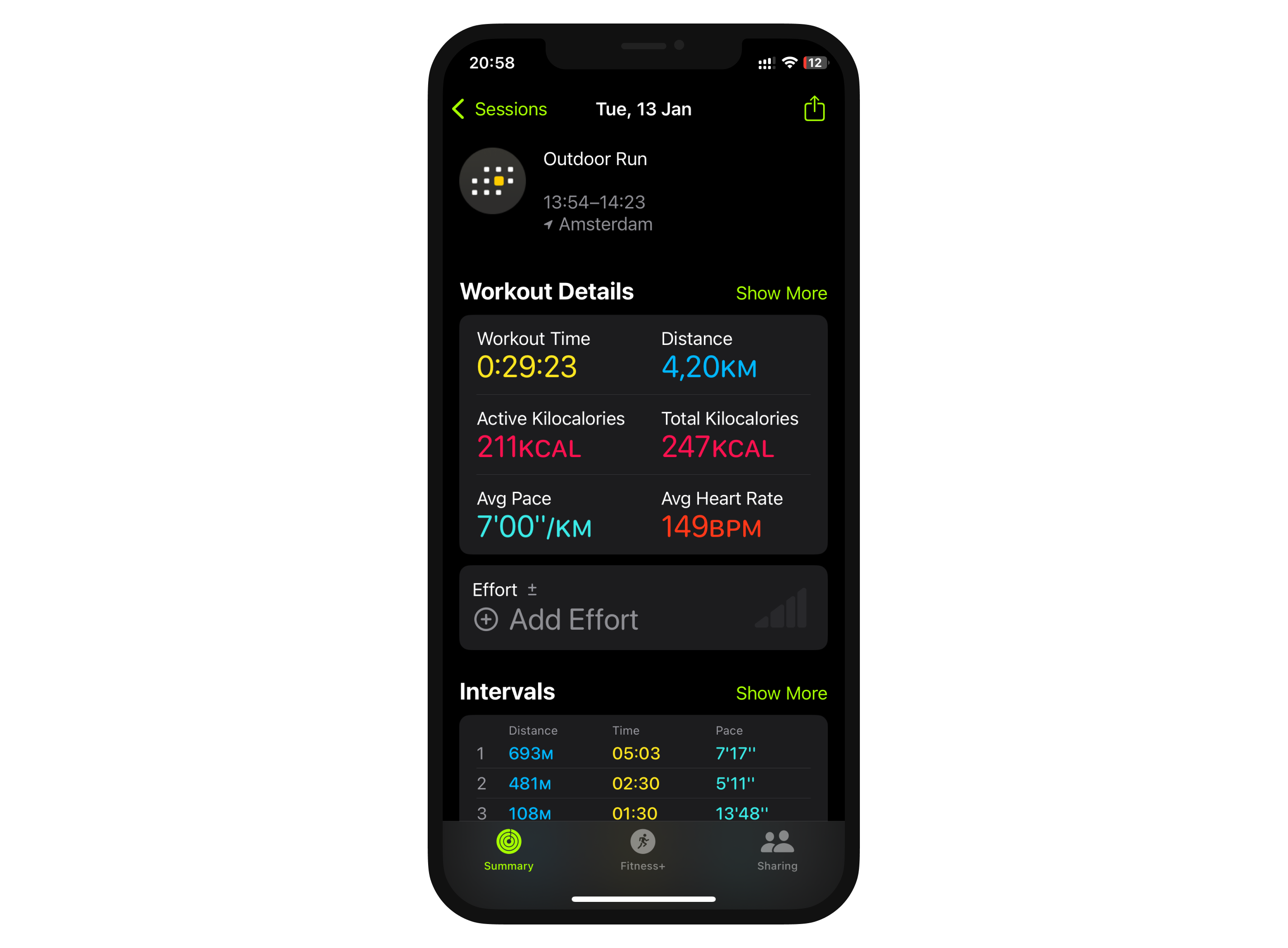
I really love Apple Workouts for its accuracy, stability, and ease of use. I always run with it. But it doesn’t do anything other than track. So, I thought:
“What if?”
Being a UX designer, I realized I could actually create a solution that fits my routine perfectly. I wanted something made by a runner, for runners, focusing only on the features I felt were useful. I wasn’t looking for a huge, “one-size-fits-all” app. I just wanted a simple tool that made my own training easier.
The Solution: Enhancing the Native Experience
1. Anchoring the Habit
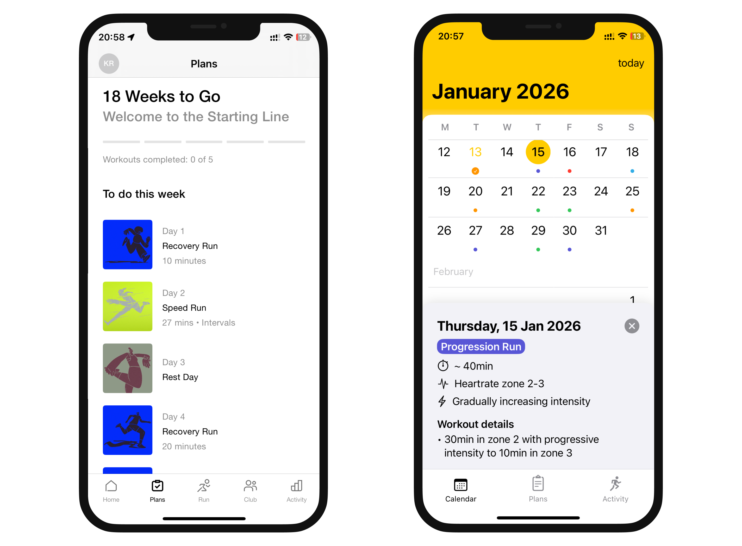
This is about eliminating Decision Fatigue. If a user has to ask, “Should I run today?”, they’ve already lost. When your calendar says “Tuesday = Intervals”, your brain stops negotiating and starts preparing.
The Feature: A dedicated calendar view that anchors workouts to specific days of the week rather than abstract “Day 1, Day 2” lists.
2. Transparency in Progress
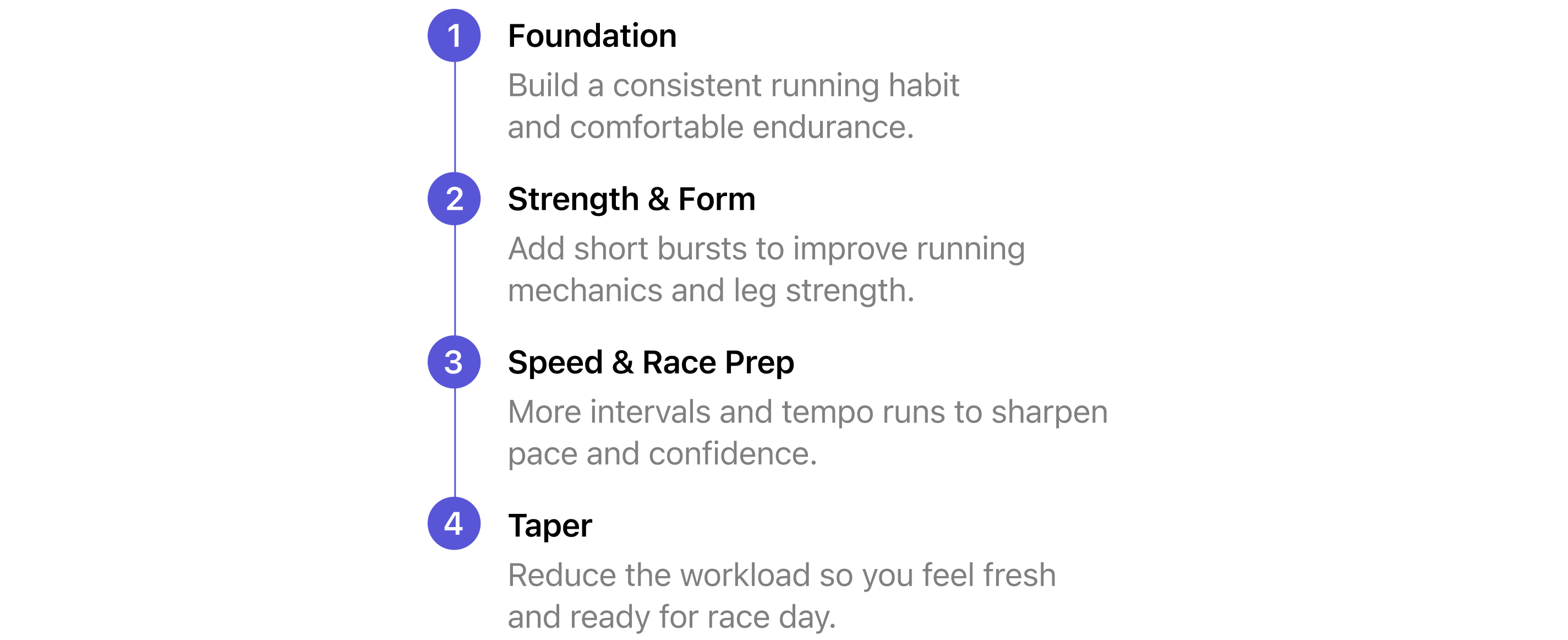
Autonomy is a primary driver of motivation. When a user understands the “why” behind a workout, they feel in control — a complex process becomes a visible roadmap.
The Feature: A structured plan where every phase is defined (Foundation, Strength, Speed, Taper), showing the user exactly where they are in their journey.
3. Strategic Load Balancing: The Training Rhythm
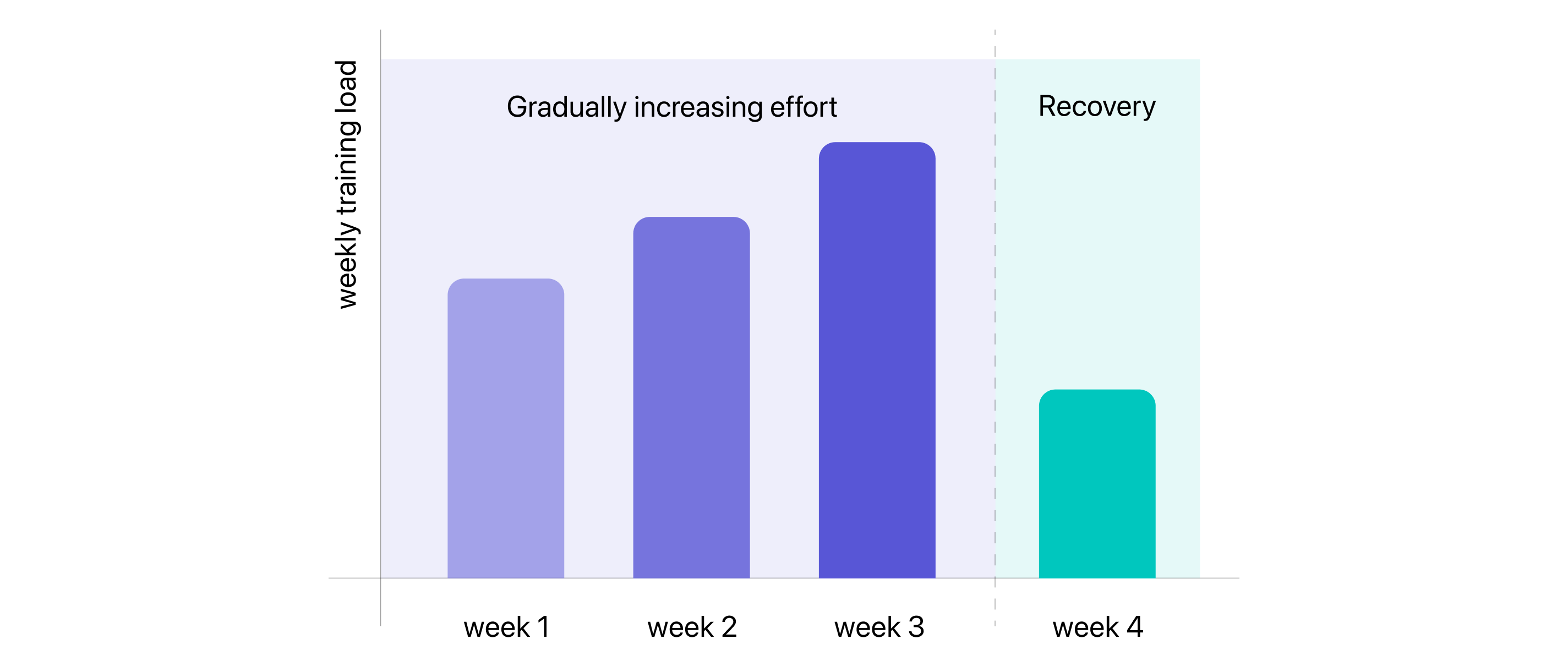
Many beginners think that to get faster, you have to run harder every single week. But the body doesn’t work that way. During my research, I found that the most effective plans follow a specific rhythm: you build up your effort for three weeks, and then intentionally back off for one week to let your body recover and adapt.
The Feature: A training logic that automatically builds in “recovery weeks” where the volume drops, allowing muscles and joints to repair.
4. Familiar Tools
I had a clear idea of what I wanted: a visual calendar synced to my specific schedule, providing structured workouts on my Apple Watch. I didn’t want to reinvent the wheel. Apple’s Workout app is the gold standard, and my goal was to augment the native ecosystem rather than replace it.
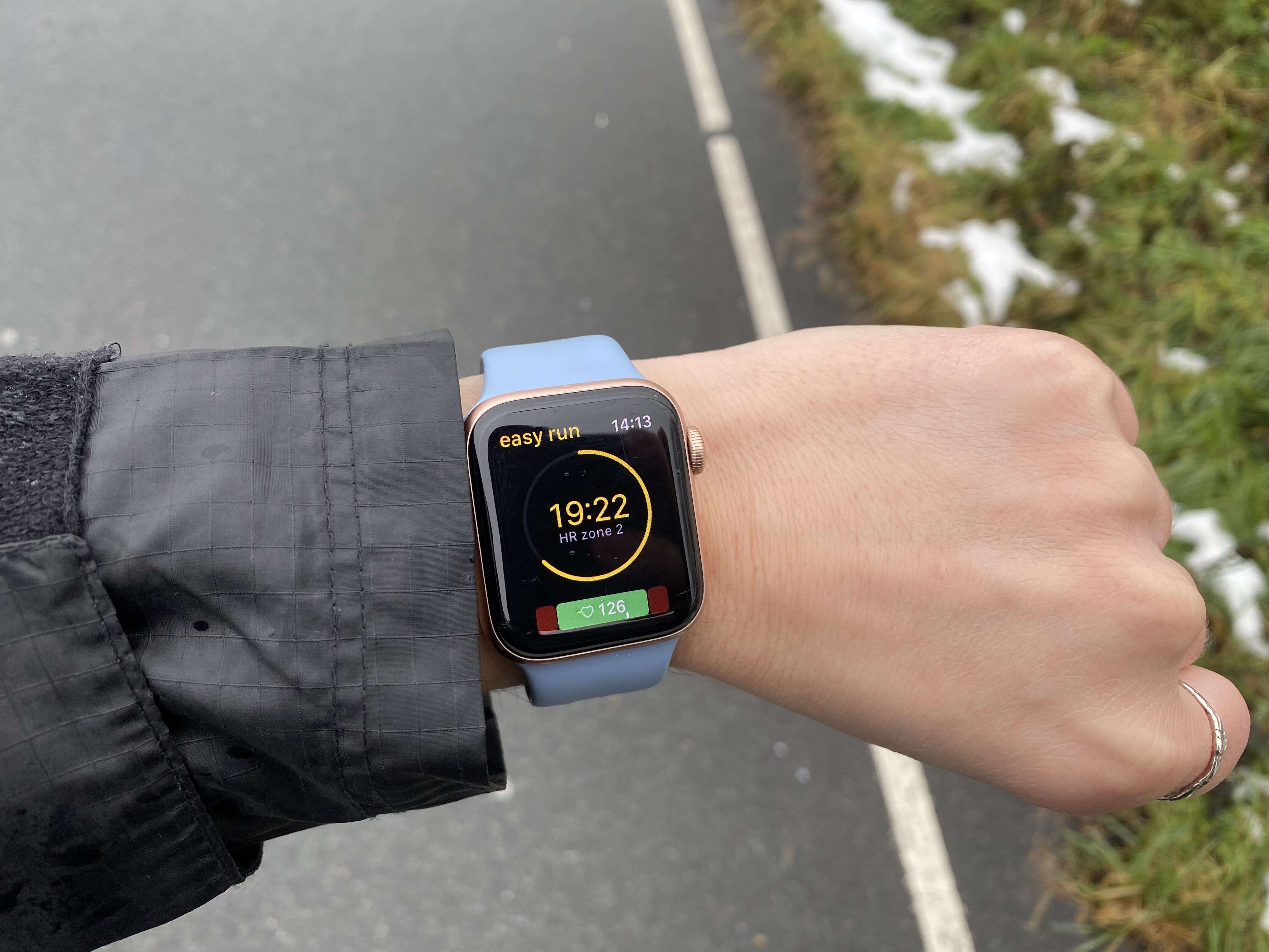
The Feature: The “brain” for your Apple Watch, providing a structured training plan that tracks different types of runs (intervals, thresholds, long runs, etc.) and syncs back to Apple Fitness seamlessly with no duplicate data.
And that’s how RunPlan was born.
The Result: Proof of Concept
I spent 10 months training for the Amsterdam Marathon using my own MVP. Life happened, I missed some sessions (completed 85% of my plan) but seeing the visual roadmap in my calendar kept me on track. I finished the marathon feeling confident.
What started as a personal tool has now evolved into a team effort. Now, together with my team, we want RunPlan to help you reach your finish line, too. We’ve officially launched with structured plans for 5K, 10K, and half-marathon distances, and we have a clear roadmap for growth and new features.
And now we’re currently looking for users for our app. If you’re interested, we’d love to hear your feedback.