By Dan · March 8, 2026
iOS 26 ‘Liquid Glass’: What It Meant for Our App
iOS 26 shipped six months ago. We finally got around to adopting it.
That’s the indie reality — Apple ships the new SDK in September, every running-app press release lights up “now optimised for iOS 26 Liquid Glass!”, and our codebase still has @available(iOS 18, *) everywhere. We didn’t have the bandwidth in September. Or October. Or November. (We were knee-deep in WatchConnectivity rewrites — separate story.) So Run Plan looked one OS behind for most of the winter.
The last two weekends we caught up. Here’s the practical writeup. What broke. What we updated. What we kept of our own visual identity. And one observation we didn’t plan to make: iOS 26 makes top-level views look more like each other than iOS 18 did. For an app whose identity used to come from a bright yellow header, that has consequences.
What Liquid Glass actually changes
Glass everywhere. More translucency, more depth, new material variants, smoother animation defaults. Sheets, tab bars, buttons — all touched. watchOS got the same treatment, scaled to the watch screen, with bigger consequences for button hit areas (more glass = different visual edges = different touch targets).
What broke in Run Plan
When we finally targeted the iOS 26 SDK and built against it, we hit five specific issues.
1. Bottom sheet backgrounds
We use bottom sheets extensively — workout details, plan creation steps, settings screens. Pre-iOS 26, we set custom background colors on these. iOS 26’s .presentationBackground modifier rendered our backgrounds correctly... in some cases. In others, it ignored them and showed Apple’s default glass material.
We tried to override the sheet background to match our app’s color, found it wasn’t reliably honored, reverted.
// Before — tried to win the fight
.presentationBackground(.color(.appBackground))

// After — let Apple's glass render, tune the foreground content
// (no modifier; default iOS 26 sheet material)
Lesson. In iOS 26, fighting Apple’s sheet material is harder than going with it. We adjusted the foreground content to look right against Apple’s glass instead of overriding it.
2. Tab bar styling
Our iPhone app has a tab bar (Calendar, Plans, Activity, Settings). Pre-iOS 26 we had specific background and foreground colors. In iOS 26 the tab bar got more translucent and the colors interacted with content underneath.
The active tab tint we’d chosen (the brand yellow) looked subtly different against the new glass background — slightly washed out, harder to see at a glance. Options:
- Adjust our brand yellow to be more saturated.
- Add a subtle background tint behind the active tab.
- Accept the washed-out look.
We went with option 2: a thin opacity-based background behind the active tab item. Looks intentional. Reads correctly against the glass.
// One overlay capsule per tab, alpha-blended in only on the active tab.
// Tuned by eye against the new tab-bar material — the .12 alpha was as
// strong as we could go before it started looking like a separate chrome
// element rather than a tint sitting on Apple's glass.
TabButton(label: label, systemImage: icon, isActive: isActive)
    .background {
        if isActive {
            Capsule()
                .fill(Theme.accent.opacity(0.12))
                .padding(.horizontal, 4)
                .padding(.vertical, 2)
        }
    }
3. watchOS 26 button hit areas
The bigger one. Imagine you’ve just done your last interval. You’re cooked. You tap End. Nothing. Tap again. Nothing. Tap a third time. You did not finish your workout. That’s the bug.
What happened: watchOS 26’s Liquid Glass defaults gave buttons slightly different visual edges. Our hit areas, measured from the old edges, were now off. Sometimes the user would tap exactly where the End button looked like it ended, and the tap wouldn’t register.
The fix is explicit hit-area sizing for workout-row tap targets and End/Pause buttons. Sized for the new glass edges instead of trusting default content insets.
// Before: trusted default content insets. The visible glass edge was
// inside the SwiftUI frame, so an obvious-looking tap on the edge of
// the button fell into the gap between the visual edge and the hit area.
Button("End") { endWorkout() }
    .buttonStyle(.bordered)

// After: hit area sized to the visible glass shape, with a forced
// contentShape so the tappable region matches what the runner sees.
// 44pt is Apple's own minimum target — we kept it as the floor and
// then sized up for the bottom-of-screen "End" specifically, because
// it's the one tap that, when missed, means "did not finish the workout".
Button("End") { endWorkout() }
    .buttonStyle(.bordered)
    .frame(minWidth: 88, minHeight: 56)
    .contentShape(Capsule())
4. Loading view material flash
Our plan-creation loading view (the 1-2 second wait when generating a plan) used a specific material. In iOS 26 the default behavior changed slightly — the material would briefly flash through to underlying content during the dismissal animation.
The fix: defer the loading view dismissal until the next view’s animation is mid-flight, so the underlying content never flashes through.
5. Workouts list scroll-zoom calibration
Apple’s iOS 26 list views got a more pronounced scroll-zoom effect by default. We’d had a custom zoom effect on our Workouts list on the Watch — visible row scales slightly larger, surrounding rows fade. Pre-iOS 26 our values felt right. With iOS 26’s default zoom + our custom zoom layered on top, the effect was too aggressive.
We dialed our zoom back. 0.85/0.55 was too aggressive, 0.90/0.65 settled in nicely.
// Composes WITH the iOS 26 system zoom rather than fighting it.
// The two factors are the scale of the row at the visible-centre
// position and the scale at the edge of the visible window. Apple's
// own scroll-zoom now contributes a few percent on top — anything
// stronger than 0.90 / 0.65 ends up double-zooming visibly.
.scrollTransition(axis: .vertical) { content, phase in
    content
        .scaleEffect(phase.isIdentity ? 0.90 : 0.65)
        .opacity(phase.isIdentity ? 1.0 : 0.35)
}
Homogenized views
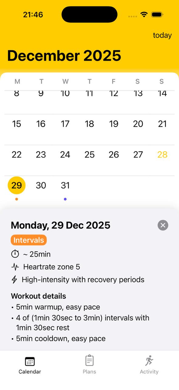
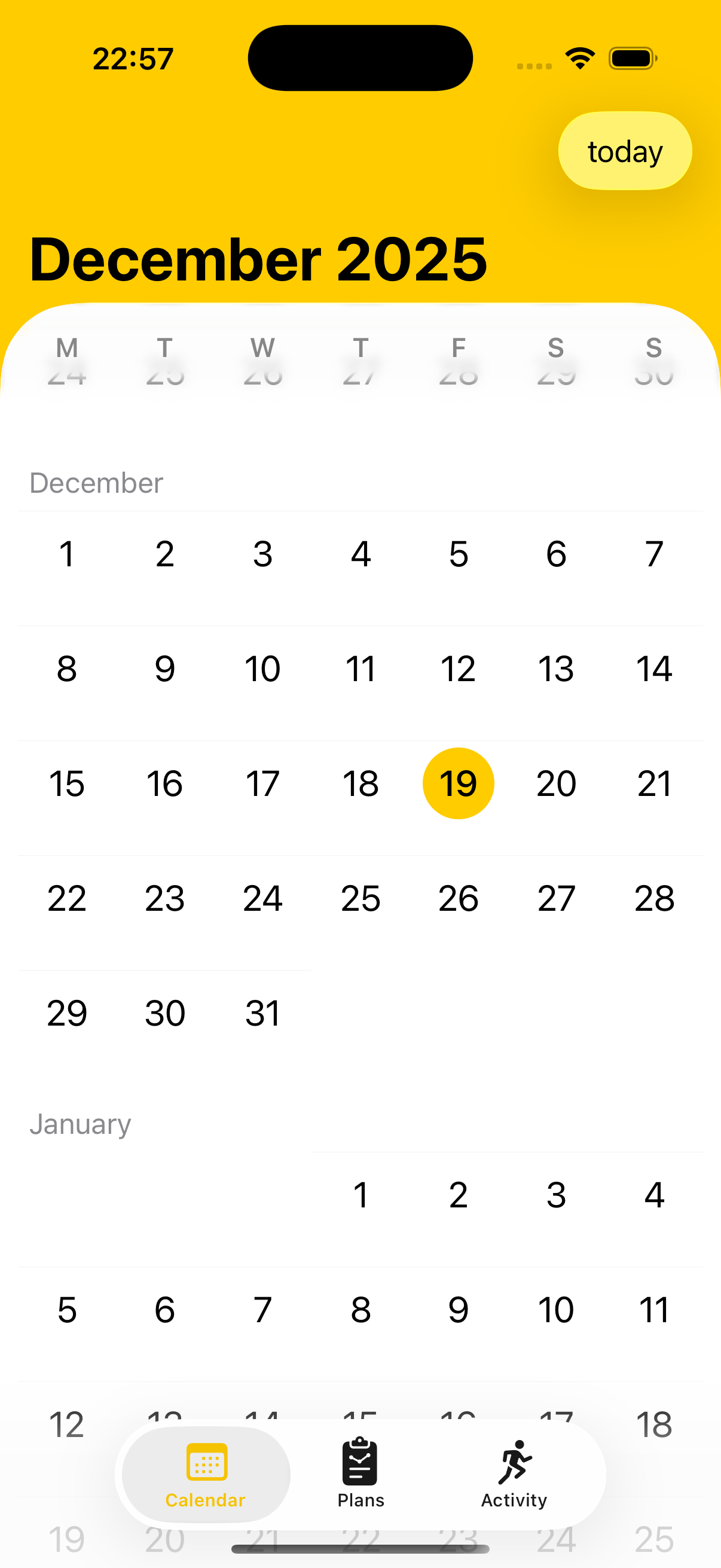
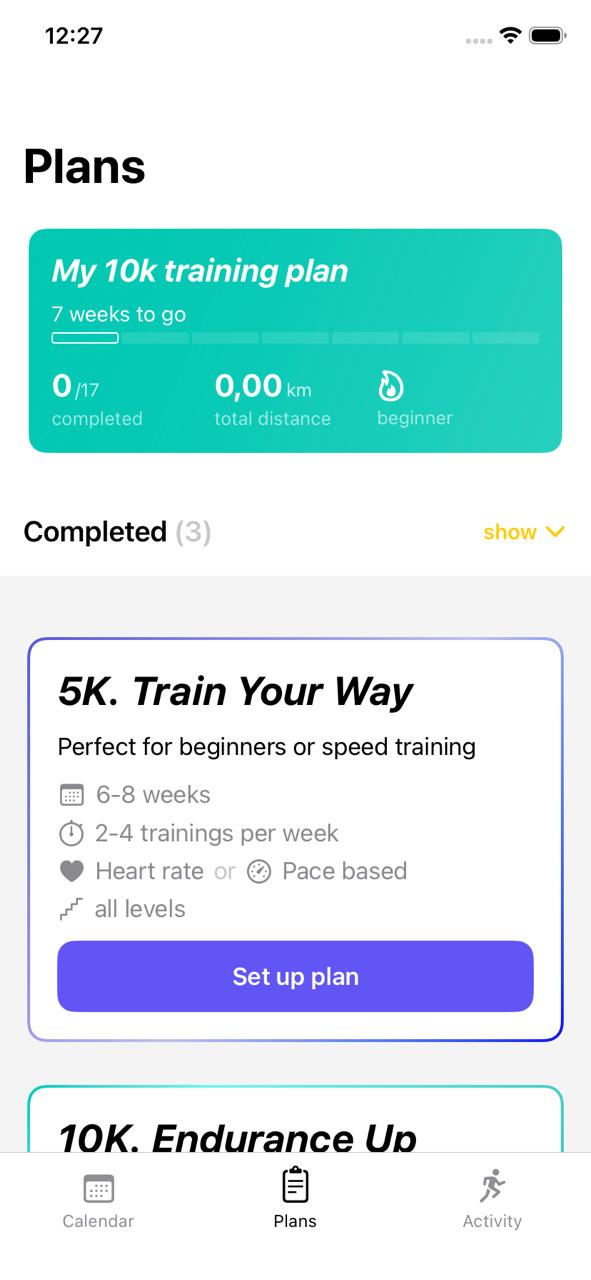
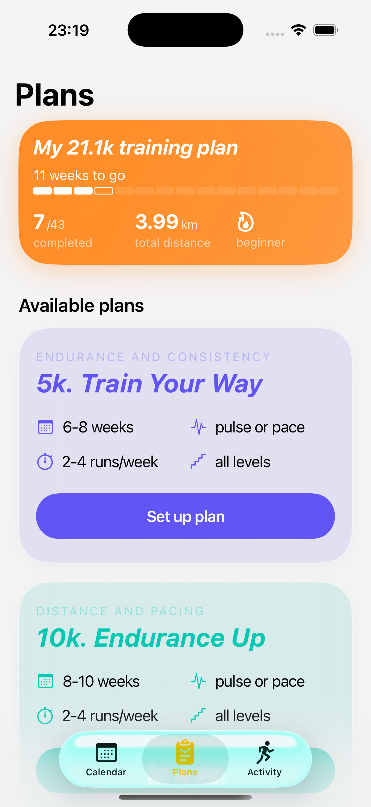
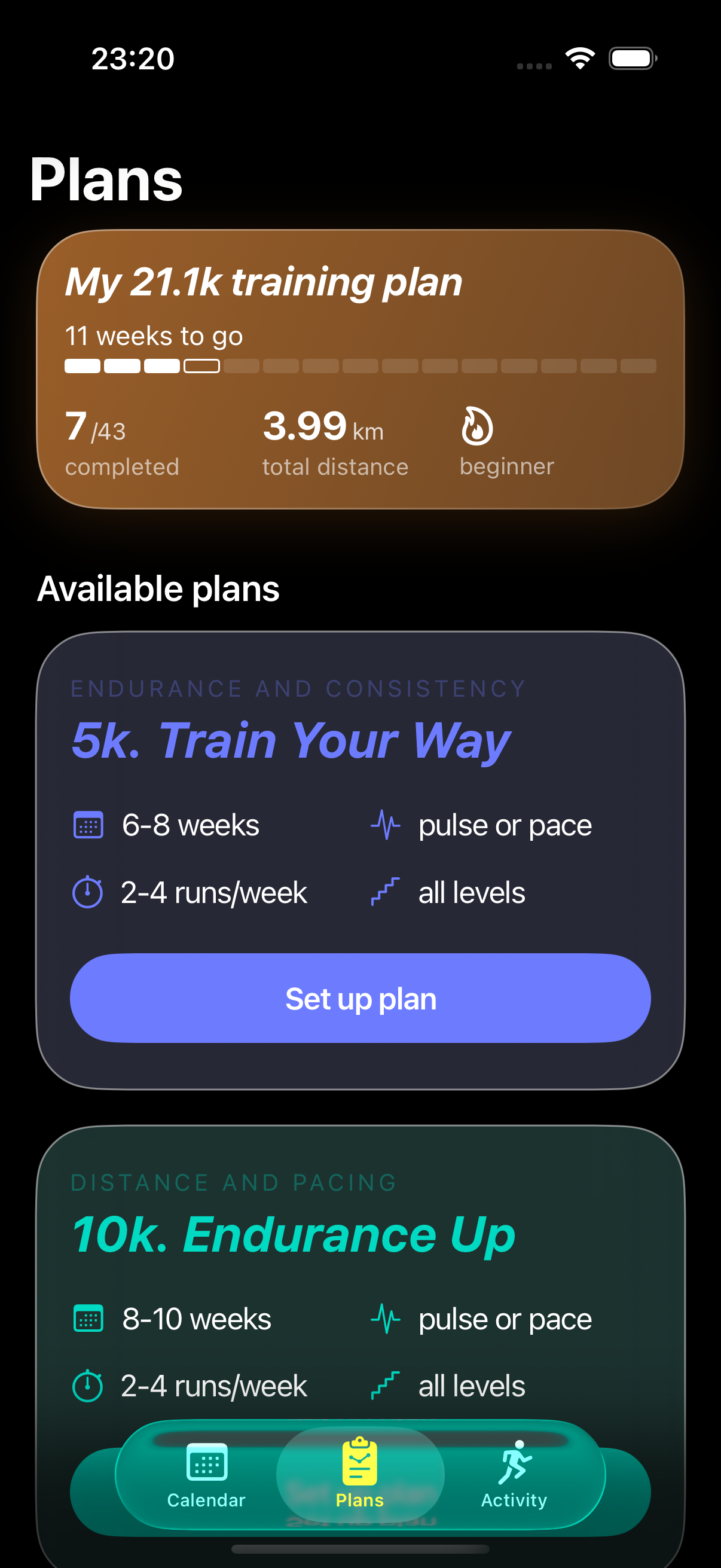
The broader change iOS 26 makes doesn’t show up in any single fix above: it homogenizes the look of top-level views. On iOS 18 each Run Plan tab had its own visual identity — the Calendar tab was yellow and warm, the Plans tab was white and grid-like, the Activity tab was its own dark thing again. We did not work especially hard to make them different; the OS let each tab stand on its own and our tints landed where they landed.
Liquid Glass pulls all of those toward a single material — translucent, slightly-tinted, depth-aware. The same glass flows from sheet to tab bar to scrolling content. The result is a visually quieter app, which is mostly good for the runner. It is also slightly less ours: the iOS 18 contrast between a yellow Calendar tab and a white Plans tab gave the brand more room to occupy than the unified iOS 26 surface does.
The Plans tab is the clearest before-and-after.
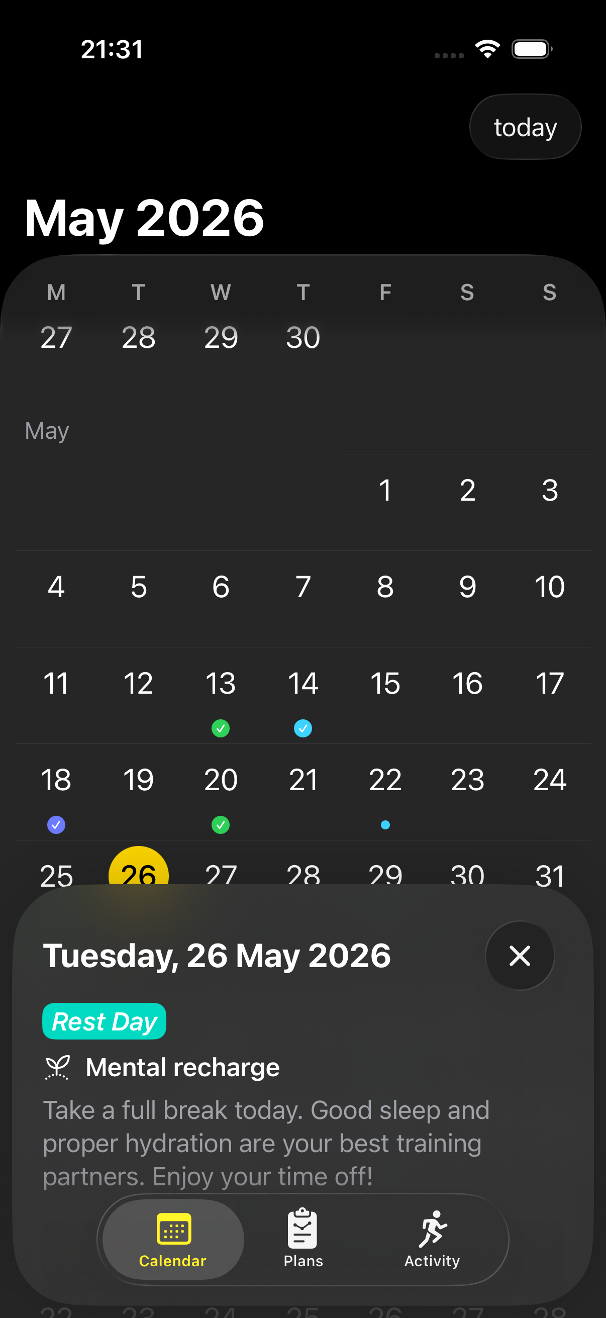
The same homogenization shows up in dark mode at the Calendar level too — both the tab bar and the bottom sheet now use the same glass material as the screen they are floating over, where on iOS 18 each piece had a clearly different surface:
In practice, distinctive iOS 18 choices — bright cards, solid sheets, contrast between surfaces — read on iOS 26 as resisting the system rather than just existing inside it. That is mostly fine, and the next section is the short list of places we chose to resist.
What we kept (against the OS direction)
A few choices where we deliberately kept our own visual identity rather than adopting iOS 26 defaults.
Our brand yellow
The hero color of Run Plan is a specific yellow (#FFCC00-ish, tweaked). The iOS 26 system tint suggestions skew softer / cooler. We could have moved our brand color closer to the OS palette but didn’t.
The brand is the brand.
Trade: in some screens our yellow looks slightly more saturated than the surrounding iOS 26 UI. We think this is fine.
Solid backgrounds on key surfaces
While we adopted glass on toolbars and sheets, we kept solid backgrounds on the main content areas of plan-detail and workout-detail views. Pre-iOS 26, this was the default. In iOS 26, the default leans more toward glass everywhere.
Why we kept solid: those views have a lot of textual content (plan structure, workout breakdown, intervals). Glass behind text makes it harder to read. Apple’s first-party apps face the same tension — try reading dense text in Mail through the new glass title bar.
We chose readability over visual consistency with iOS 26.
Dark mode behavior
Liquid Glass introduces a new translucency model that interacts with dark mode in subtle ways. Our app has specific dark-mode colors we’d carefully tuned. We kept dark mode mostly unchanged from pre-iOS 26 — solid dark backgrounds, brand yellow for accent, white text. We don’t use Apple’s new dark glass materials in most places.
Reason: dark mode in a fitness app is for runners checking the app at 6 AM before a workout, or 10 PM after one. The priority is “readable in low light,” not “visually trendy.” Glass in dark mode looks beautiful in static screenshots and worse during actual use.
Performance implications
A subtle but real cost: Liquid Glass uses more GPU than the prior design language.
Translucency and blur effects, especially when stacked (a glass tab bar over a glass sheet over a glass background), compound. On iPhone, this is irrelevant — even the cheapest iPhones can handle UI compositing of arbitrary depth.
On Apple Watch, it’s a real budget item.
Our Apple Watch app has two rules now:
- Don’t stack more than one glass material in a single view hierarchy. Tab bar OR sheet OR background — pick one. Don’t compose them.
- Avoid animation on glass. Static glass is cheap. Animated glass (sliding, fading, scaling) is expensive. We use glass on the workout-screen tab bar but not on any actively-animating element.
These rules came out of testing the iOS 26 build on real Apple Watch SE 2 (our reference hardware) and noticing perceptible frame drops where there hadn’t been any before. We hadn’t changed the UI. The system rendering was just doing more work.
This is the same shape of problem we wrote about in February, in a different layer: there is no algorithm that makes the chip faster, only choices about what to ask the chip to do. With Kalman it was GPS noise vs CPU. With Liquid Glass it is visual fidelity vs GPU. On the watch, both are a finite budget the runner is also spending on the workout itself.
The opt-in / opt-out story
Small Apple detail worth knowing: many iOS 26 Liquid Glass visual changes are partially opt-in.
- Apps targeting iOS 26 SDK → new defaults.
- Apps NOT targeting iOS 26 SDK (or explicitly opting out via
Info.plistkeys) → backward-compatible appearance.
For Run Plan, we chose to fully adopt iOS 26. Target the new SDK. Use the new defaults. Fix what broke. The alternative would have been to look one OS behind on iOS 26 devices — a worse user experience.
But indie devs do have the option to defer. If you can’t afford a few weekends of OS-update tax right at iOS 26 launch, you can stay on iOS 17/18 SDK and let your app render in compatibility mode for a year. Catch up next time.
We didn’t because Run Plan is small enough that the catch-up work fit in two weekends. Bigger app, we might have made the other choice.
What it feels like to update for a new design language
A few observations from the inside.
It always takes longer than expected
We thought catching up to iOS 26 would take a weekend. Two weekends spread over four calendar weeks, with reverts, re-tunes, and edge cases (the loading view flash, the watch button hit areas) we missed on the first pass.
Most of the work is taste calibration
The technical changes (new modifier names, new material types) are easy. The hard part is judgment:
- Does this look right against the new glass?
- Is this color saturated enough?
- Is the spacing on these buttons feeling right?
No code change gets these right automatically. We spent more time looking at the app than writing code. Unusual for engineering work. Typical for design work. Updating for a new design language is mostly the latter.
The user benefit is real but small
Run Plan looks more current on iOS 26 after these updates. A new user downloading the app today on an iOS 26 device sees something that feels native. The same user, downloading a week ago, would have seen something slightly dated against their OS.
Whether this affects retention or downloads — we don’t actually know. App Store reviews don’t usually mention “looks current”; they mention features or pricing. But the cost of not updating compounds over time as the OS-vs-app visual gap widens. We let it widen for six months. That’s about as long as we wanted to push it.
iOS 17 backward compatibility costs you
We support iOS 17 + iOS 26. The cost of supporting iOS 17 is real: every place we use a new iOS 26 modifier needs a backward-compatible fallback. Our codebase has a fair number of:
if #available(iOS 26.0, *) {
    // new glass behavior
} else {
    // pre-iOS 26 fallback
}
Pre-iOS 26 sheet layout was different. So were tab bar styling and navigation behavior. Each one adds a code branch and a thing-that-can-go-wrong-if-we-edit-without-checking-both-paths.
At some point — probably v1.12 or v1.13 — we’ll drop iOS 17 and just target iOS 26+. That removes a meaningful maintenance burden. Indie devs are usually slow to drop older OS support because every user on an old OS is a user you’d lose. But the engineering tax does add up.
So — was it worth it
Visually: nice. As an indie tax: a couple of weekends. As an alternative to not updating: worth it.
The trick, for next time, is not waiting six months. (We say this confidently now. Ask us again next September.)
Further reading
- Apple — Human Interface Guidelines: Materials — the primary reference for what each glass material is supposed to be used for.
- Apple —
presentationBackground— the modifier that lost the fight in §1. - Apple —
scrollTransition— the SwiftUI hook the Workouts-list zoom is built on; the iOS 26 defaults skew more aggressive than before. - Apple Watch Is Enough — why the Watch-side glass tax matters more than the iPhone side.
- Matrix Multiplication Doesn’t Make Apple Watch Batteries Last Longer — the same chip-budget problem, written from the GPS-noise side instead of the GPU-fidelity side.
- The iPhone–Watch Sync War Story — what was eating our bandwidth instead of the iOS 26 update in the autumn.
Run Plan is an indie iOS + Apple Watch training planner built by a 2-person team in Amsterdam. No accounts, no ads, no subscription. Your data stays on your device.